Don't Be Fooled by Statistics
Statistics provide numbers that confer credibility to ideas, proposals, recommendations, and conclusions. But we do ourselves a disservice if we unthinkingly accept reported statistics without understanding how to interpret them—and without realizing that sometimes, they are presented with the deliberate intent to deceive.
One of the most common and complex statistical tools of deception concerns absolute versus relative risks. For example, if an ad claims that a particular drug reduced the incidence of a certain condition by 50 percent, you’d justifiably be impressed. But if, in the absence of the drug, only two out of a thousand people are likely to get the condition, use of the drug means that only one person out of a thousand, rather than two, will be likely to get the condition.
Absolute and relative risks are two ways of saying the same thing. But the relative risk—50 percent, in this example—is often used to make an effect seem larger than it really is. The absolute risk—the one out of a thousand—is a more meaningful but less impressive result. Be on guard for vendor claims that may be attempting to mislead you in the same way.
Some statistical representations aren’t intended to deceive but can easily be misinterpreted. For example, life expectancy has increased significantly in the US since the 1900s. This is due to many things, such as improvements in nutrition and advances in medical care, and it means any given adult has a longer life expectancy this year than last year or five years ago. But that’s also because a key factor in the rise in life expectancy has been dramatic decreases in the rate of infant deaths. With infants deaths figured into the average, the resulting average is a lot higher.
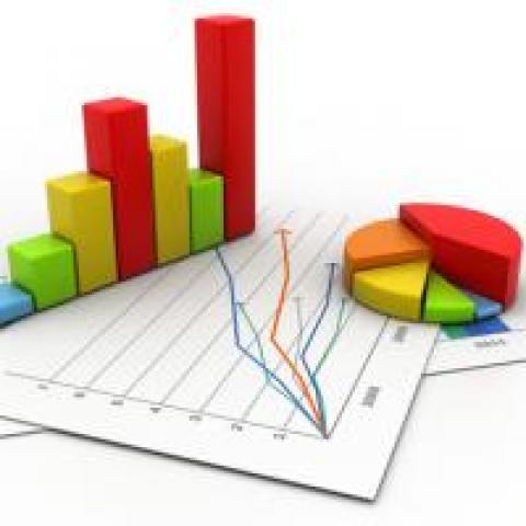
Graphs offer numerous ways to visually deceive, such as by fiddling with the X or Y axis. By not setting the origin of the Y axis at zero, it’s possible to make small effects seem much larger. Alternatively, it’s possible to select the data points that seem to show a large effect and omit the data points that suggest otherwise. It’s up to us to challenge what we’re seeing—and not be lulled into buying an expensive product—when a graph seems to portray an impressive result.
Finally, a more everyday example: When you encounter a claim that something is some percentage faster, better, cheaper, easier, etc., be sure the claim specifies what the superlative is being compared to. It’s easy to be impressed by semi-attached numbers, such as that a product you’re considering runs 45 percent faster. This is a meaningless claim unless you know what that 45 percent is being compared to. Buyer beware.